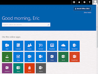
It's really designed by and for developers. :-)
How many users are there happy to spend time to get familiar with these 18 icons, to figure out which one they should click, and then start to work there?
What users want to do here?
1. Create / modify a document (OneDrive, SharePoint, Video, Word, Excel, PowerPoint, OneNote, Sway)
2. Talk / contact some one. (Mail, People, Groups. Where's Lync?)
3. Figure out what need to do. (Mail, Calendar, Planner, Tasks, Delve)
4. Web surfing. (Yammer, Newsfeed, Delve)
If users could only see 4 entry icons here, I believe that they would feel much more comfortable.
But, it's still a bit messy.
SharePoint is the place to store information. Are emails information? How about People contact details? Calendar events? Tasks? Why so much information is stored in other separate places?
If we could store all information in SharePoint, then many of those services could be moved into SharePoint User Profile module, such as Mail, People, Groups, Calendar, Planner, Tasks, Yammer, Newsfeed. (OneDrive and Delve are already there)
We even don't need Microsoft Graph anymore! That's a big relief to developers, as they only need to learn how to access SharePoint data.
Do you like this idea? Any comments are welcome!
[update, 2016-09-29]
If a document needs to be shared in SPO, Yammer, Planner and Groups, does that mean that the same document has 4 separate copies?
To manage the versions and permissions of this document must be hard. :-)

No comments:
Post a Comment